King Website Design & Build
King Solutions is a privately-held Logistics provider that was founded in 1989 just outside of Minneapolis, Minnesota. What started as an asset-based 3PL has now grown beyond into a full-scale logistics service provider that offers end-to-end, customized solutions for businesses across many industries.
Overview
King Solutions had been a client of my agency for multiple years when from 2022–2025 they underwent an ownership transition and then leadership transition. Resulting from this, my team organized a "new client" intake, a revised marketing engagement, and website project in 2025.
View The Website ProcessTeam
Kelly Cahoon, Client Lead and Creative Director
Georgia Snyder, Lead Designer
Julia Peterson, Designer
Georgia Snyder, Lead Designer
Julia Peterson, Designer
Skills
Client Communication
Brand Application
Website Design & Build


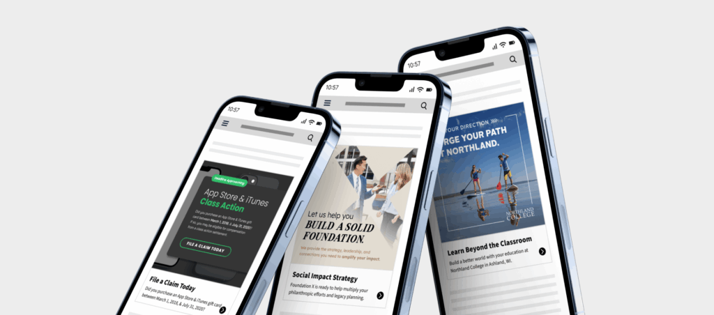
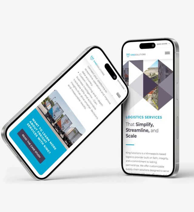
New Website Highlights
Mockup Prototyping in Figma
Figma's component and variable tools were used to create responsive elements for the presentation of website mockups.
ViewUsing Color as a Visual Marker
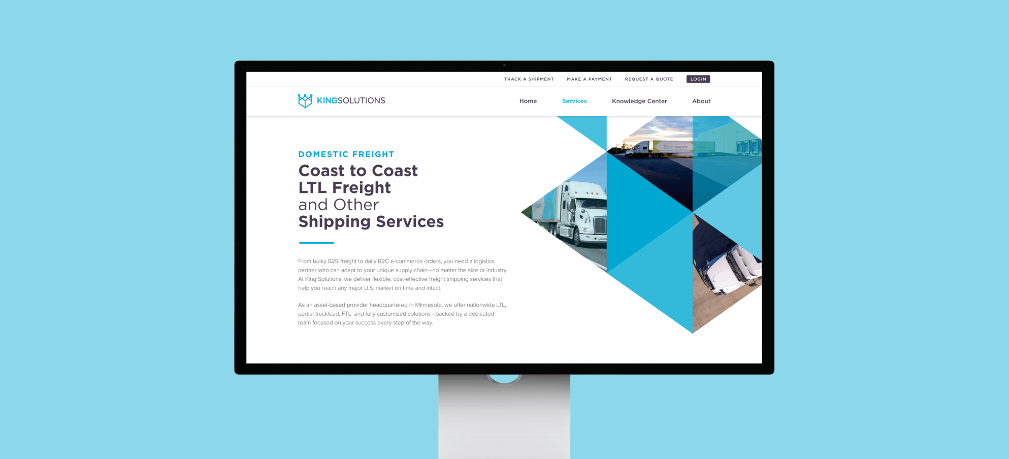
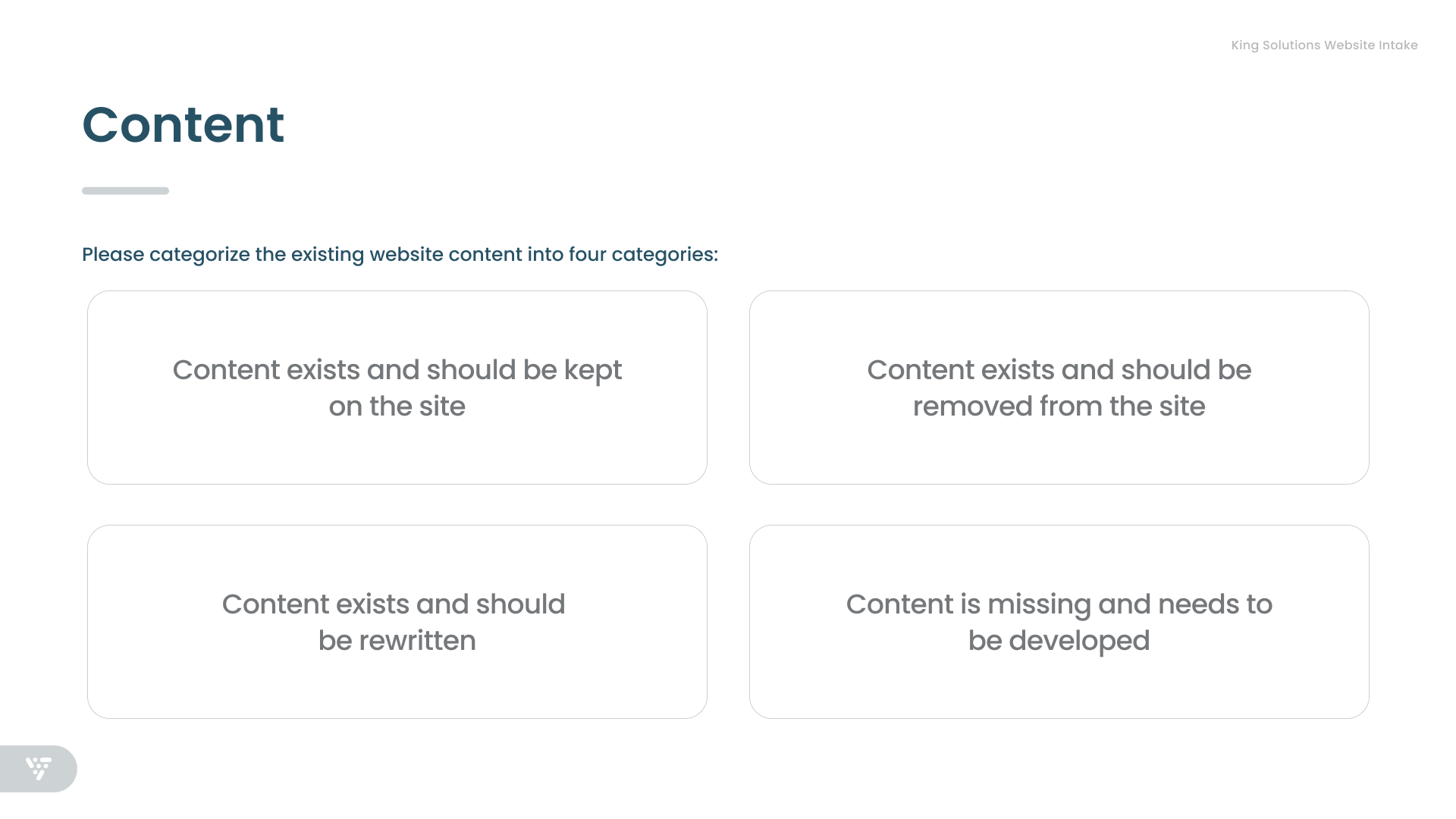
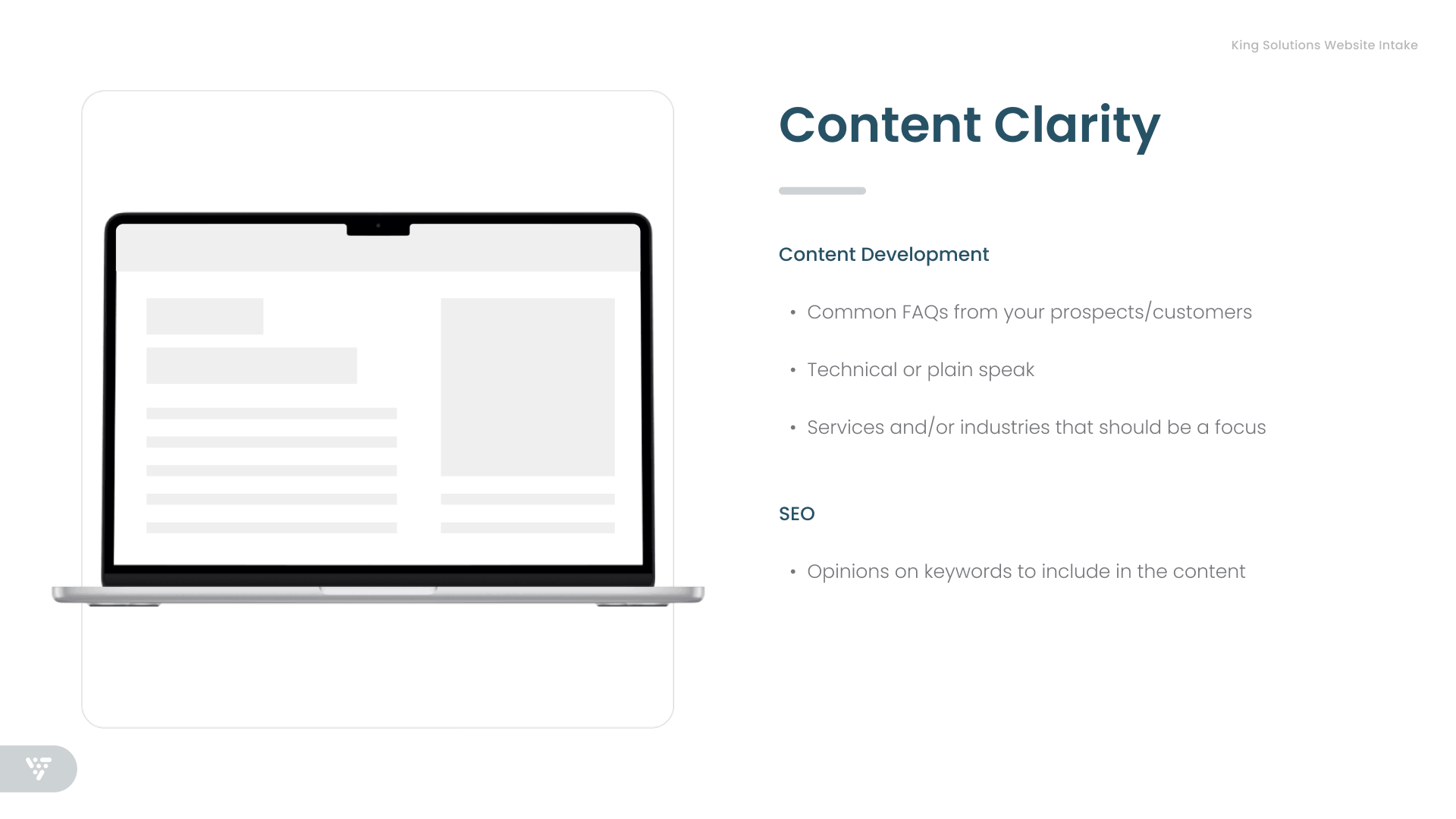
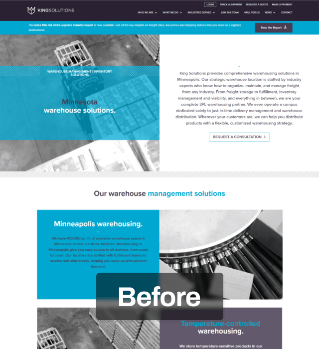
In 2025, my team conducted a fresh intake to support the development of a more modern, strategic web presence. A key component of this process was gaining a clear understanding of the client’s full range of services, then distilling and defining their core offerings to inform the website rebuild. Through this discovery phase, we identified three core service pillars that collectively represented the breadth of the client’s capabilities.
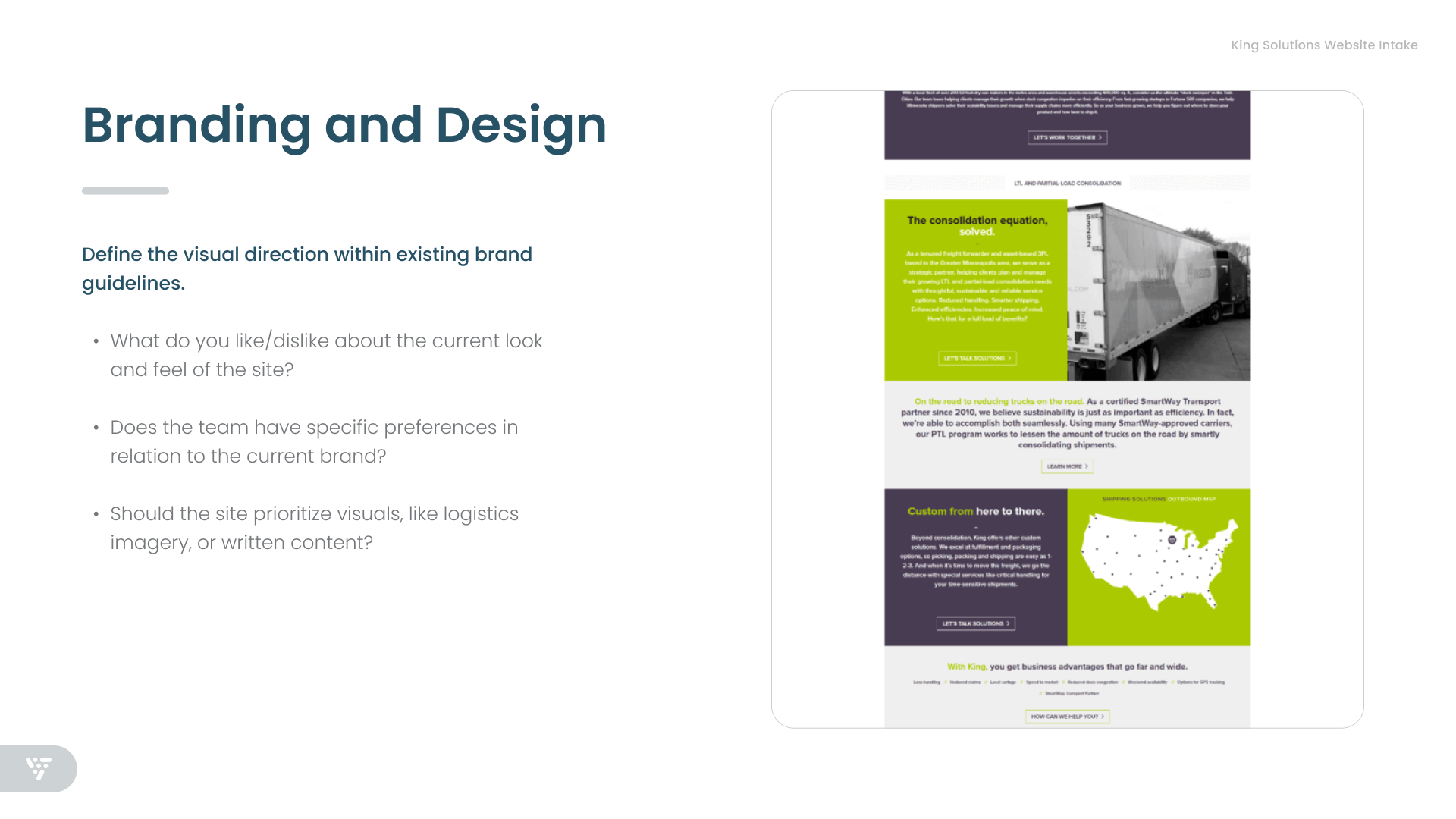
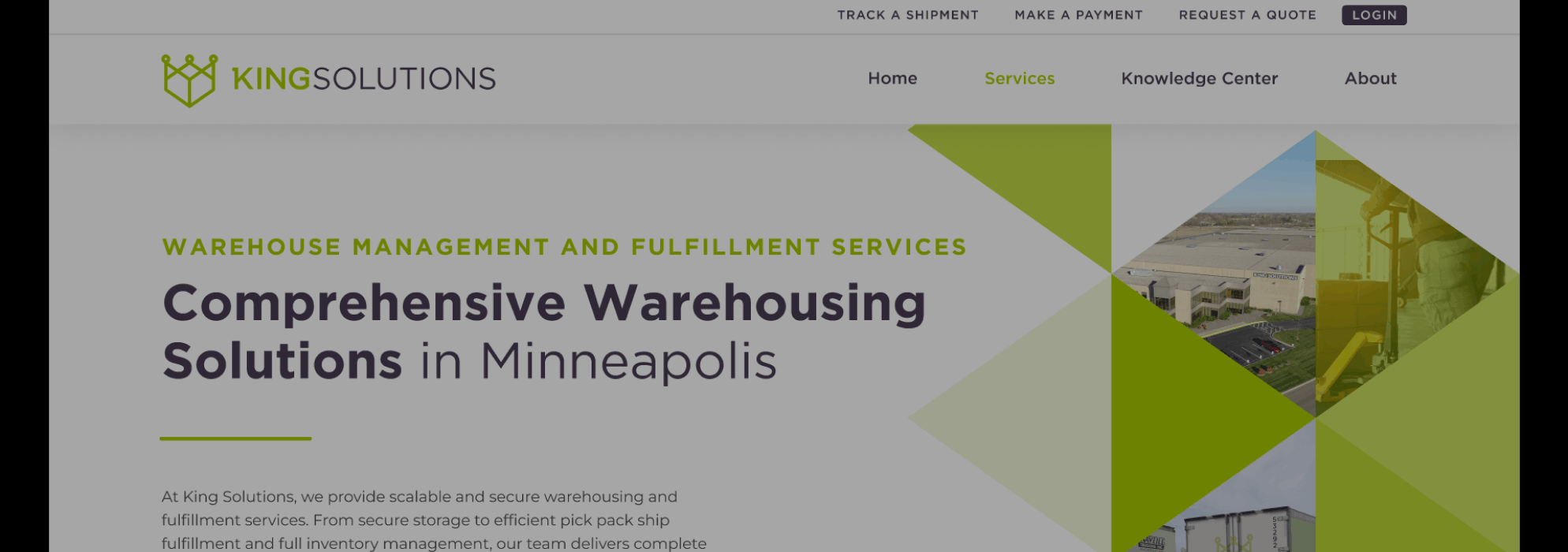
From a visual branding perspective, the client wanted to retain their existing look and color palette, which consisted of four primary brand colors. To bring greater clarity and cohesion to the system, we recommended assigning one color to each service pillar as a visual cue, while reserving their core purple as the unifying brand color used across the broader identity. You can see above how the website follows this color format with purple used for general brand elements, blue used for Transportation & Freight Management, orange used for E-Commerce, and green is used for their Warehousing Services.
From a visual branding perspective, the client wanted to retain their existing look and color palette, which consisted of four primary brand colors. To bring greater clarity and cohesion to the system, we recommended assigning one color to each service pillar as a visual cue, while reserving their core purple as the unifying brand color used across the broader identity. You can see above how the website follows this color format with purple used for general brand elements, blue used for Transportation & Freight Management, orange used for E-Commerce, and green is used for their Warehousing Services.
Associated Work
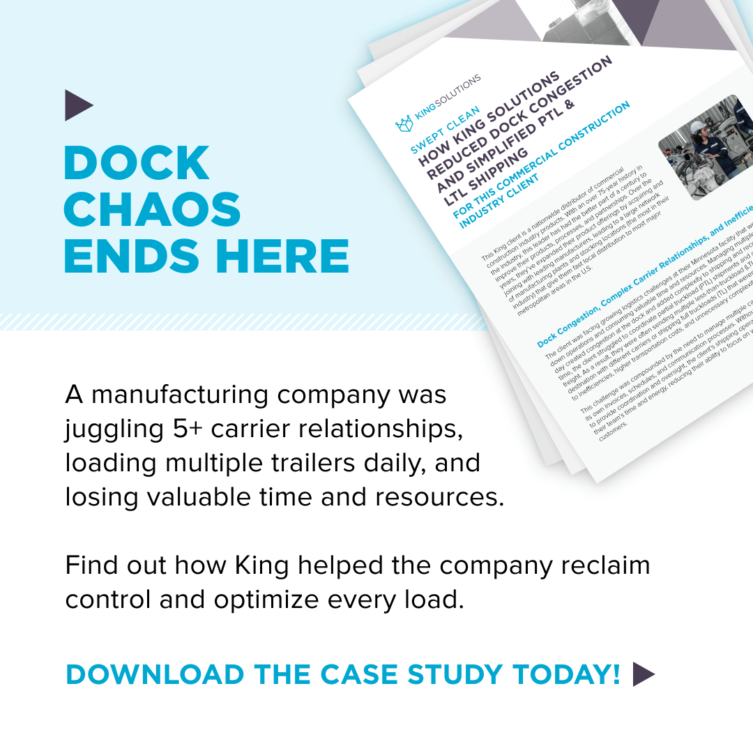
Logistics Campaign
Ad 1: Transportation
This ad and content piece were created for the client's Transportation & Freight Management service pillar.
Ad 2: Transportation
This ad and content piece were created for the client's Transportation & Freight Management service pillar.
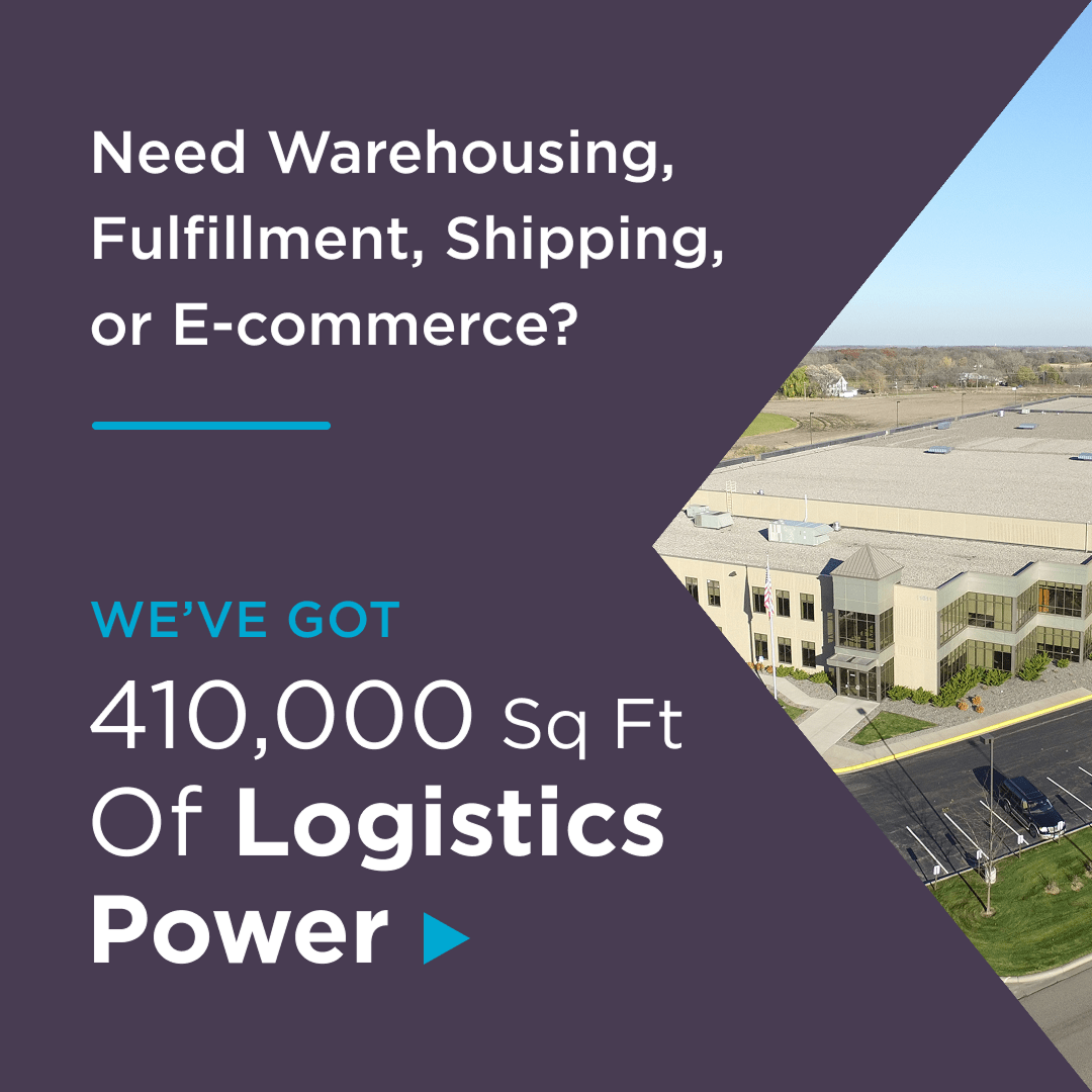
Ad 3: General
Ad 3 & 4: General
These ads cover multiple pillar services that the client offers. As a result, their core brand color—purple—was used for the design.
This ad covers multiple pillar services that the client offers. As a result, their core brand color—purple—was used for the design.
Ad 4: General
This ad covers multiple pillar services that the client offers. As a result, their core brand color—purple—was used for the design.

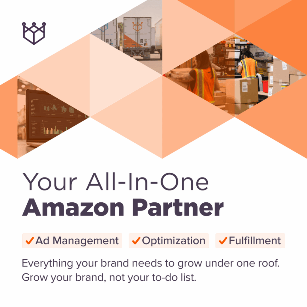
Ad 5: E-Commerce
Ad 5 & 6: E-Commerce
This ad and webinar were created for the client's E-Commerce Operations service pillar.
These ads and webinar were created for the client's E-Commerce Operations service pillar.
Ad 6: E-Commerce
This ad was created for the client's E-Commerce Operations service pillar with a focus on Amazon.
Campaign Details
Logistics Campaign
Posted: LinkedIn
Focus: Core Services
Design: Kelly Cahoon
Content: Kevin Withers
Strategy: Marketing, Design, & Analytics Team
Content: Kevin Withers
Strategy: Marketing, Design, & Analytics Team